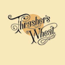
New Thrasher's Wheat Logo

Logo graphic by Geoff Moore, Silver Moon Art & Design
And here it is!
To say that we're pleased with the way the artwork turned out for our new Thrasher's Wheat logo would be quite the understatement. In fact, we're downright ecstatic!
Just a huge, huge thanks to our contributing artist Geoff Moore of Silver Moon Art & Design in Maui, Hawaii.
The other day we recounted that our old logo -- John Barleycorn -- must die. The logo above is at long last a realization of a dream of ours 13 years ago that came on a smoke ring day when the wind blows. Previously, we were never able to get the graphic to work out right and do justice for a Neil Young fan site. That is until Geoff came along to help us out. Here's what Geoff has to say:
It's an honor to be a part of Thrasher's Wheat – such a wonderful and informative source for Neil Young fans – through my logo design as inspired by Thrasher himself. I appreciate Thrasher for allowing me to write this biography about my journey into being obsessed with Neil Young's music, and the man himself, as so many of us here are.
The first cassette I bought by Neil was Everybody Knows This is Nowhere in 1992. Apparently Cinnamon Girl had become a song I needed to have on tape after hearing it over and over again on Chicago classic rock stations, and I bought it specifically so I could blast it as I dropped my senior year homecoming date off at the dance. Hilarious. It was the first time I had a Cinnamon Girl of my own, so I guess I had to make sure my fellow classmates understood this.
I never did listen to the rest of that fine recording until later down the road. By the time I got to college, my girlfriend there was into Neil. I hooked up with her to the soundtrack of Harvest Moon and the Unplugged albums. At the time, I told her, I couldn't get into Neil because he was "too folky" for my taste. But the appreciation grew over those college years, and I finally did give EKTIN full listens, especially in my ceramics class as I remember it. I took my girlfriend to my first Neil and Crazy Horse show in 1996 at Deer Creek, IN. We had lawn seats, and most of the show went over my head as I was still not too versed in Neil's music at the time.
It was not until 1999 when I scored amazing seats to the St. Louis Fox Theater solo show that I got deep into Neil. I found Hyperrust and started seeing the set lists he was playing leading up to that St. Louis show. I didn't know many of the songs, so I started seeking out albums I didn't have so I could hear these unknown songs before the show. I found a bootleg copy of On the Beach on CD, bought "Buffalo Springfield", Tonight's the Night, After the Goldrush, and maybe some others trying to educate myself before the show. After seeing this show, I was absolutely blown away, and that was about it for me. Ever since, Neil Young has been bar none my favorite musician. I really relate to Neil's dark side, the "haunting" loner vibe of his early music, and the sharpness of the man himself… thoughtful, articulate, cynical, funny and honest.
I joined the Rustlist in 2000, and since then have seen Neil live many times (nothing has ever topped that '99 show though) and have attended two International Rust Festivals (IRF's). Rust has been an amazing venue for me. My first B&P was for the '99 St. Louis show, and I have traded with many folks over the years and built up a respectable but not overwhelming collection of unreleased material. I have learned so much about Neil, and made so many great connections with people on Rust. It was not until I attended my first IRF that the community became so tangible to me ... there are so many wonderful people and good friends I have made through the list. It's really a beautiful thing.
I still listen to Neil about everyday. There's no one who does it for me more, and I have never gotten tired of his music.
In addition to the honor of designing the new Thrasher's Wheat logo, I have had the honor of designing two IRF T-shirts. I am a graphic designer by trade, and really enjoy doing digital illustration, so these projects have been very rewarding for me. You can visit my web-site here: Silver Moon Art & Design
Thanks for reading, and thanks to Neil Young, Hyperrust, the Rustlist, and Thrasher's Wheat!
Keep on Rockin',
Geoff
Yes that was me with the doves
And thank you Geoff!!!
So if anyone is ever in need of graphic art work, we can tell you that working with Geoff is a very smooth and totally professional experience.


Click to Enlarge Geoff's IRF Posters
We still have a few more design changes that we'll be rolling out in the future, so stay tuned. In the meantime, let us know what you think of Geoff's art.


 Human Highway


 Concert Review of the Moment


 This Land is My Land

 FREEDOM In A New Year


 *Thanks Neil!*


![[EFC Blue Ribbon - Free Speech Online]](http://www.thrasherswheat.org/gifs/free-speech.gif)


 The Unbearable Lightness of Being Neil Young
 Pardon My Heart


 "We're The Ones
  Thanks for Supporting Thrasher's Wheat!


 This blog
 (... he didn't kill himself either...)
#AaronDidntKillHimself







 Neil Young's Moon Songs




 Civic Duty Is Not Terrorism
 Orwell (and Grandpa) Was Right


 What's So Funny About


41 Comments:
nice work.....show us more!!
Meh.
I love this logo, what a great idea!
Great new logo; thanks Goeff!
Mike
Expecting To Fly
Wow thats some great stuff!
Thrasher...you KNOW I am your biggest fan and LOVE the site!!!!!...however, I don't care for the new logo....it is a nice piece of art and compliments to the artist....I liked the Harvest artwork and that artwork is a classic....however...to me the new logo lacks inspiration and is obviously based on HARVEST artwork..which again is beautifil in its own way but seems to me the NEW logo could be someting more original and not something that is based clearly on previous album artwork...in fact I LIKE the existing logo better..at least it was original...
Again,,,just my opinion...sample size of one (1)..everbody is an art critic....
Again...you KNOW I am your biggest fan and LOVE the site!!!!!...
Just some thoughts from Jeffry (from IBM)
dig
Not very original is it?
Nice craft, not art.
well, i hate to say it cuz Geoff is a great guy and I LOVE his work on the IRF stuff and the graphic elements here are pure talent, but count me amongst the folks that this logo just doesn't do it for them. There's just something about the way the words look that doesn't look quite right. what worked for the word "Harvest" doesn't look so good for Thrasher's Wheat (tho i DO like the 's' in Thrasher's)
The 'T' in Thrasher looks a little bit like it needs a good feed to me... :-)
Well done Geoff & Thrasher- I like the new Artwork - it has impact-when I first saw it I Cooed to myself "Coo !". I might also say cool or "It''s hot !" It has that Harvest effect so apt for Thrasher's WHEAT.
john.
since i got an email asking me to say what i think..
i like Geoff's poster work, you have talent,
and I loved your personal story about Neil,
it's hard to get me to remember wayback to high school days - blasting music so people could " get you" too funny
but, .... the new logo is just...blah,
and way too derivative.
What immediately came to mind was " the imitators"
hey, you asked, it's still a great site, geoof still has talent, I just think he needs to work on making his own mark.
I agree with Jeffry (from IBM).
Yeah... The IRF stuff is brilliant, this is um...not.
Sorry.
I think the new logo is tremendous. Excellent homage!
I hope you're going to roll out t-shirts...
Art C
I think the new logo is excellent. To me, the point of the logo is to name the site while clearly suggesting Neil in a simplified design that is easily recognized. That it clearly reflects "Harvest" is EXACTLY what it is supposed to do! Good job all around.
Charlie
I never understood why John Barleycorn had to die.....but I am a little slow, eh?
:)
Not very original.
Where are the logos used? I can't recall ever seeing the original one. Where on the site is the new one shown?
This logo conveys the spirit of the Neil I love best. The homage to Harvest is fine with me. Well done!
Love it. Very apt for thrashing wheat :)
New Neil is allways better:
http://tinyurl.com/b25gnb
I totally agree with Charlie.
". . .the point of the logo is to name the site while clearly suggesting Neil in a simplified design that is easily recognized." Great job Geoff and Thrasher.
Hmmm... something doesn't feel right about the logo. It looks nice! Amazing typeface-- using the harvest logo seems uninspired though. Nothing about it makes thrashers wheat stand out as it should. Sorry.
Nice image.
Ont, Canada
Congratulations, Thrasher, I like your new logo. But, much more important, I like your continuing effort and the whole wonderful site. It is such an important contribution for us Rusties. Carry on - and keep on rockin', please!
Thank you so much
New Logo: Count me on the side of blah, derivative. It's just OK.
Slight correction regarding the 1996 show--it was AT Deer Creek Ampitheater (aka Verizon Wireless), which is in Noblesville, Indiana, a few miles north of me. I was at that show as well and it was so awesome when Neil was playing the solo in Slip Away, it was about the third song, and by then people were sitting in the seats, and during the solo people started to stand up to check Neil out, it was so intense.
indydave
What else you got? Not to be mean to Geoff. Zejt
Good Job!
logo looks cheap, unimaginative.
someone comming here for the first time will get a bad impression if they see that first.
I must admit my first reaction was the new logo was a bit simplistic & unimaginative, but having read the comments I agree with those who see it for what it is: an obvious reference to NY's most recogniseable album cover. According to globe bestriding internet monster Google it takes someone 0.3 of a second to decide if the site they have arrived at is what they want, then 5-8 seconds to decide if they want to stay (I'm not a geek, but it's my job to know such dull stats). Most new visitors to the site will instantly know they've arrived on a NY site by instantly recognising the logo design and will stay & look around.
Us existing visitors to TW may want something more complex with an obscure reference only we would understand, but when was the last time we checked out the logo on the homepage? Like me, you probably go straight to the news page to find out the latest Archives 'release' date/hear some more 'dreadful' new tracks/find out how much we need to sell our Grandma for, so we can afford the next gig ticket...
TL in the UK
Hi Thrasher -
Well, in some ways you asked for it, by openning up for 'opinion' on the logo.
In my view, art and song are quite personal, and will bring reaction if left out in the "open air" (as in drinking bananas).
I too write songs and play/sing much Neilsongs and many of my own. (maybe not real good, but....)Anyhow, though I certainly welcome positive accolades of "my art' I am sometimes stung by the opposite take of critical review, though most is not necessarily meant as such.
Leonardo didn't paint over the Mona Lisa smile and I'm sure Neil doesn't change too many words when some think he's F#@!^*G UP!
So keep things the way they are. You, my man, are in control of YOUR ART and YOUR site.
Jay Loson
aka Speakin'Out in NY (S.O.N.Y)
I love the artwork...derivative? that's the point. Very polished job in my opinion. And the site is great..well it always is. I'm totally impressed. As a former pop art poster collector this gives me a warm, retrospective glow. well done!!
I think the logo's fine - it does what a logo's supposed to do - indicates straight away that you're on a Neil Young site (you'd have too have been living in a cave not to make the Harvest connection!).
Technically it's a tricky one to do as well, I suspect the designer's had to re-assemble the Harvest words into Thrasher's Wheat, by means of scanning in and tracing and tweaking - not an easy task I at all. Last time I looked there wasn't a Harvest font out there.
So credit where it's due! I think the designer's done a good job. As someone once said (Benjamin Franklin?) "Any fool can criticise, and most fools do'
Pete UK
Lake of originality.
Beautiful logo, thanks.
the W looks off kilter
'The W looks off kilter'
Jeez give the guy a break, didn't think the Neil Young community had so many art critics!
I don't know,but you would have thought Geoff had merely scrawled graffiti on a masterpiece given some of the negative comment here.
This new logo effectively represents that this is a site dedicated to Neil Young.The old one,as good as it was,did not really do that.Geoff,with whom I have no connection,has done a great job.
The artwork is a great tribute to and parody of the original Harvest Album front cover.I think it looks very good and symbolic of what Thrasher's Wheat is all about - Mr Neil Young !!
Wow! Stunning work.
Geoff here - just happened to be back reading this after I don't know how long. I liked a lot of the positive and negative comments, good points on many of them. I agree most though with those who pointed out that this logo is a very recognizable Neil association for the site. The most original idea? No. But I'm glad Thrasher wanted to go with this, I think it's a great homage to the original Harvest art. Thanks for all of your kind comments!
Geoff
Yes that was me with the doves
Post a Comment
<< Home