Feedback is Back
Actually, we're looking for some feedback.
Earlier in the new year, we rolled out a new design layout using a 3rd column. So far, so good technically speaking. But we would like to get reader's feedback on the usability of the new layout.
Admittedly, we have a lot going on on this page. The idea with the third column is to push up some widgets and links for greater visibility like the NYAS/BA badge. Also, the original single sidebar had become quite unwieldy and needed some objects removed. So we've been playing around and making some adjustments.
As this point, we would like to know what you think works and doesn't. What seems extraneous or essential? What should be higher or lower? What should in the right or far right sidebar?
Any feedback would be appreciated. Drop a comment below or email us:
thrasher ATSIGN thrasherswheat DOT org
Thanks!


 Human Highway


 Concert Review of the Moment


 This Land is My Land

 FREEDOM In A New Year



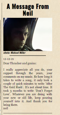
 *Thanks Neil!*


![[EFC Blue Ribbon - Free Speech Online]](http://www.thrasherswheat.org/gifs/free-speech.gif)


 The Unbearable Lightness of Being Neil Young
 Pardon My Heart


 "We're The Ones
  Thanks for Supporting Thrasher's Wheat!


 This blog
 (... he didn't kill himself either...)
#AaronDidntKillHimself







 Neil Young's Moon Songs


 Civic Duty Is Not Terrorism
 Orwell (and Grandpa) Was Right


 What's So Funny About


5 Comments:
Thrash, I think the "3 bar" concept is fine, but maybe one suggestion... if you are a regular visitor to the site and maybe pressed for time in some cases, it maybe handy to have the recent comments at the top so you can see at a glance if any fresh wheat has made it to the silo so to speak.
Also, just a question?
When there are several interesting topics goin' on and just by shear volume of responses on each thread,the old topics "drop off the back"do any comments made on the old topics still get shown as a "recent comment for readers awareness?
It's a feast or a famine sometimes..But always enjoyable!
Doc
I think the links to the new topics on Rust List should be higher up, maybe just below the link to Sugar Mountain setlists? It's always my second stop (after TW, of course!) on my quest for Neil news!
Thrasher,
For me the major draw on your site is the excellent content you create on the left side and then the discussions that ensue ... I rarely find myself focused on the stuff to the right other than during a few late night exploration sessions around the site. So, I am not experiencing much of a difference post the change. But, I very much appreciate your never ending pursuit of making it newer and different which sort of mirrors Neil's approach. Still loving your site and waiting hopefully for the next leg of the never ending tour or some other new live NY development.
Cheers,
Dan
I'm with anon 7:07 - it's the content that matters (and frequency of new information (and fun discussion that invariably ensues)), and that's why I keep coming back as well.
As for the design, I guess it's win/lose either way. You have a lot of content on the right side, and it's all really good content, and should be visible and easily accessible... so either you have this really long single column that stretches into oblivion, or two columns that each go half-way to oblivion. Either way, all that content is still vying for space.
I could take it either way. I think your site looks great with 1 column or 2. And during my own late-night excursions I don't generally mind either way.
I'd say it's better only in that it pushes more content toward the top, making more of it instantly visible.
Thrash, just a response to a suggestion or comment sometimes would be nice....it might just help my credibility! lol
luv doc
Just a question about comments...
Why am I the only one that has a "trash bin" symbol after my comments
Is this an ominous omen? lol
And what is "bloggerhacks" signifying, in small "italic blue" on "Recent comments"..I've gone to the link and can't see the connection..too cryptic for me I'm afraid!
doc
Post a Comment
<< Home